To The Trains
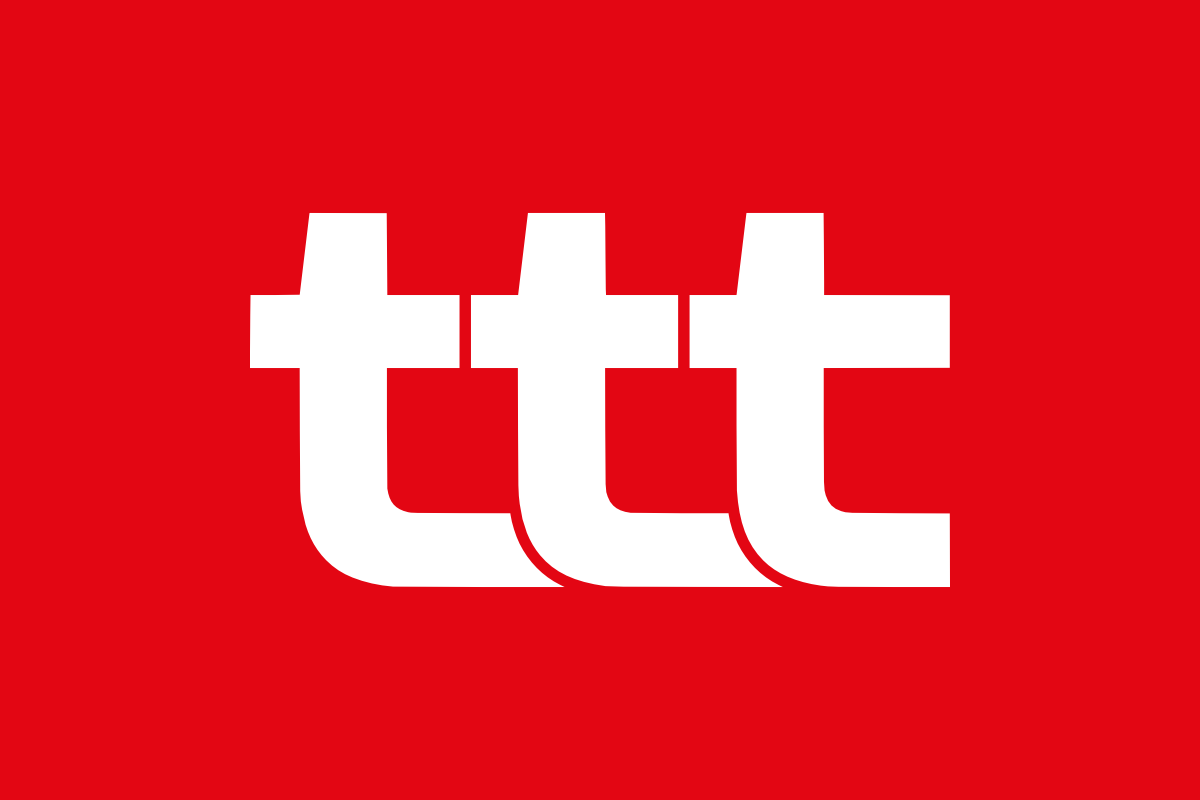
The logo is at the heart of the visual identity. It was designed first, and every other component revolves around it. It uses three modified t glyphs from the DM Sans typeface, arranged in the shape of a track. The white variant is used on red or busy backgrounds, whereas the red variant is used on white backgrounds.
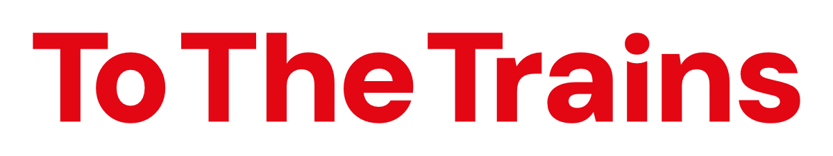
The word mark represents the To The Trains brand using only text. The type is based on DM Sans with modified kerning and glyphs. The red variant can be used when the word mark is displayed on white or off white backgrounds.
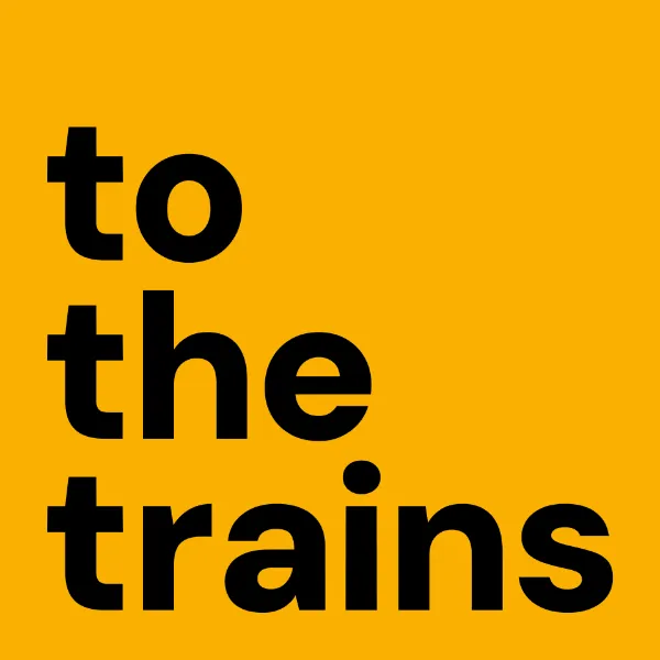
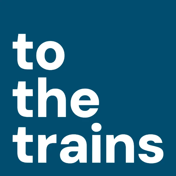
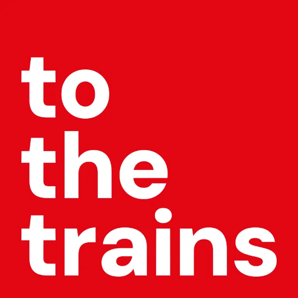
The stack is an alternative to the logo in certain applications, such as video thumbnails. The stack can be displayed on blue (#004D6F) or yellow (#F9B000), as well as on Aspect Red (#E30613).

To The Trains is a personal creative project dating back to July 2020, when I set about creating a YouTube channel. It would be an independent media outlet to document Britain's railways, run by rail enthusiasts for rail enthusiasts. The To The Trains portfolio has since expanded to include a podcast and a website.
This is a means through which I can exercise and develop my array of media production skills and techniques while producing content I am passionate about. Taking on this project has improved my freelance work across the board, and the YouTube channel in particular serves as an archive of my development over the last few years. I encourage you to take a look.